- Available for withdrawal
- Account balance
Empowering retail investors to manage their 401(k) with confidence.
- Role
- Senior Manager, UX Design
- Years
- 2017 – 2019
- Team
- Five designers
- Scope
- Product design & strategy
Summary
Managing a 401(k) withdrawal relied heavily on support calls, and investors often felt guilty or discouraged making one. The goal: self-service, with guidance and support that lessen a withdrawal’s negative impact.
Senior Manager, UX Design, and design lead for retail investment. I managed a team of five designers, led the design sprint, and carried its findings into prototypes, testing and the company’s design system.
Testing showed people might not know where the withdrawal flow started, so we restructured part of the sitewide navigation and its wording.
The design sprint
Two days, with customers in the room.
- Map
From evaluating options to finalizing a withdrawal
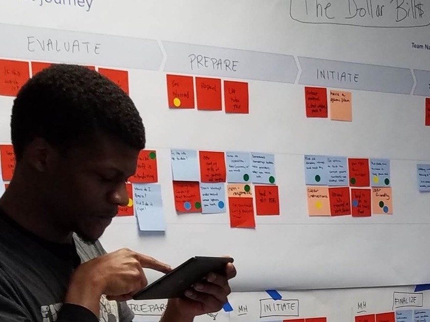
I led a two-day workshop, a modified Google Ventures design sprint, with customers, designers, engineers, stakeholders, subject-matter experts and product managers. Teams mapped the journey: evaluate, prepare, initiate, finalize.
- Jobs
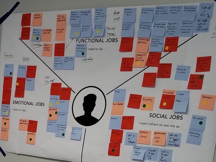
What people need, feel, and want to be seen as
Jobs-to-be-Done uncovered the functional, emotional and social side of each decision. On the wall: confident, in control, able to provide for family.
- Riley
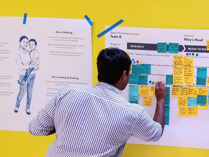
Sketch the perfect journey
Teams sketched the ideal journey for Riley, our persona. Riley’s question: why is it so hard to know where to start, or who to talk to?
- Friction
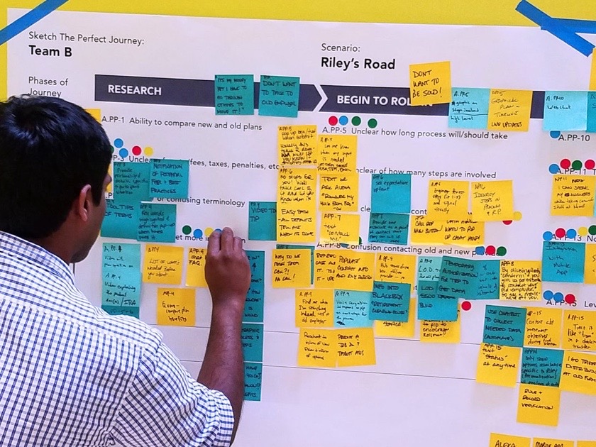
Pain points, phase by phase
Pinned to each phase: “Unclear how long process will/should take.” “Too much paperwork.” “Ability to compare new and old plans.”
The withdrawal overview
Put the options beside the account.
Key concepts: self-service for the whole account, including withdrawals; tools to understand a withdrawal’s impact and explore alternatives; financial wellness and goal setting; and emotionally supportive language.
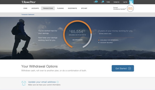
You’ve worked hard for
your savings.
Now keep your savings
working hard for you.
Rebuilt in code from the legible parts of the original. The photograph behind the hero is not reproduced.
Investors often felt guilty or discouraged making a withdrawal, so the overview opens with emotionally supportive language.
The amount available to withdraw and the full account balance, together, above a clear way in.
The options are introduced together, with one place to start. Guidance and financial wellness concepts give the decision a broader context.
Testing
Most test subjects went straight to their account balance, but four in ten struggled to find it.
Regular tests confirmed or falsified each idea. One showed people might not know where the withdrawal flow even started, so we restructured part of the sitewide navigation, and its words.
Navigation test · ten participants
Found their total account balance directly
Found it, but only after backtracking
Did not find it
What testing changed
Language and copy played a major role in discoverability of product features. Familiar words like “withdrawal” greatly outperformed technically correct terms like “distribution.”
Leading the team
I scaled our learnings from prototypes and testing into the broader company design system.
As UX design lead and Senior Manager, I managed a team of five designers and contributed to T. Rowe Price’s company-wide design system.
My team met weekly with the other design chapters across the innovation lab to share patterns.
Credits
- Role
- Senior Manager, UX Design · UX design lead, retail investment
- Team
- Five designers
- Work
- Design sprint facilitation, user research, product strategy, design system
- Worked with
- Product managers, engineers, customer support, subject-matter experts
- Tools
- Sketch, InVision, Miro, Jira
- Years
- 2017 – 2019